The Engineering Zoo: When the Dashboard Gets Better but the Zoo Does Not
A zoo turns engineering activity into animal scorecards and gets exactly the behavior it rewards. Connecting my essays on beavers, sharks, turtles, and octopuses with the lessons of Git Spark, I look at how accurate measurements become misleading judgments — and why better reporting can look so much like better work.
Leadership Philosophy Series — 13 articles
- The Power of Lifelong Learning
- AI and Critical Thinking in Software Development
- Sidetracked by Sizzle: Staying Focused on True Value
- The Managed Transition Model: Leadership Promotion as Power Exchange
- When the Pressure is On - Late Sprint Hotfix Governance
- Accountability and Authority: Walking the Tightrope
- Turtling: When a Team Stops Looking for the Door
- Every Arm Is Still Searching: The Octopus Model of Agency
- The Dependencies I Never Upgraded
- The Beaver Builds a Pond
- The Shark Stops Evolving When It's Done
- The Engineering Zoo: When the Dashboard Gets Better but the Zoo Does Not
- Tactical Excellence, Strategic Truth: Who Checks Whom
Filed under Leadership and systems thinking
Topic cluster
Project Leadership and DeliveryProject Mechanics, leadership judgment, delivery accountability, and team operating models.

The visitor reviews at a zoo keep getting worse, even though the development team keeps shipping.
The mobile tickets don't scan. The map sends families to a closed exhibit. The food-ordering app announces that lunch is ready twenty minutes before anyone in the kitchen agrees. The penguin feeding time is wrong again.
The owner calls the development manager into his office. "Our technology is supposed to make the visitor experience better," he says. "I need the development team to improve."
The manager agrees. It's a reasonable request, and he has capable people. What he doesn't have is a clean way to show whether the work they're doing is making a visit to the zoo any better.
What happens next brings my animal metaphors up against the individual engineering scorecard.
Something easier to measure
Visitor experience is messy. A bad lunch review might involve an integration defect, an understaffed kitchen, or an order-ready event that means something different to the app than it does to the person preparing the food. A closed exhibit might reflect stale data, a late operational decision, or an animal that has declined to participate in the schedule.
The manager can't isolate all of that in a sprint report. Developer activity, though, is already waiting for him. Commits, pull requests, work items, builds, deployments, defects, code coverage, AI-assistant usage. Lots of data. Surely enough to tell whether engineering is improving.
So he builds a dashboard.
The Zoo Engineering Excellence Dashboard has five animal profiles, each scored from zero to 100. Higher is better for the first four; the Ostrich is a risk score, so lower is better. There are trend arrows, team averages, percentile rankings, and an executive view. Someone has spent considerable time getting the colors right.
| Profile | What earns a better score |
|---|---|
| Beaver | More commits, pull requests, lines changed, and completed work |
| Shark | Shorter cycle times, more releases, and higher sprint throughput |
| Turtle | Fewer recorded defects, rollbacks, blocked items, and rework |
| Octopus | More experiments, prototypes, alternate approaches, and AI usage |
| Ostrich | Fewer aging issues, stale tickets, and unresolved problems |
The names are whimsical. The numbers look serious. The owner finally has something he can compare from one month to the next.
What happened to the animals
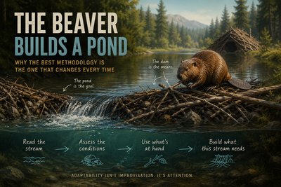
The Beaver Score rewards construction. That sounds appropriate until I remember what I was actually describing in The Beaver Builds a Pond. The pond is the objective; the dam is the engineered response. The useful work depends on the conditions, and sometimes the right response is a small repair to a structure that's already doing its job.
But ponds are hard to count. Sticks are easy. The dashboard counts sticks.
At the zoo, a Shark earns a better score by releasing more software. The disclosure application I described in The Shark Stops Evolving When It's Done kept solving its customer's problem for years without needing me to keep changing it. The discipline was paying attention and intervening when the evidence justified it. A quiet repository can be successful engineering. On this dashboard, it looks like a shark with a motivation problem.
The Turtle becomes a quality badge for avoiding visible trouble. That's a particularly strange promotion for an animal I once used for a team that had surrendered its agency. Turtling happens when the search for the next reasonable move stops. A developer investigating a difficult dependency and a developer who has quietly given up can have equally old tickets. Their next actions matter more than the age field.
Five unrelated prototypes can improve an Octopus score. The exploration I described in Every Arm Is Still Searching depends on a shared objective and a search that changes as we learn. Those prototypes don't become useful exploration because somebody entered them into the same tracking system. An AI session isn't useful just because it happened.
Then there's the Ostrich. In the Turtle essay, I used ostriching as shorthand for avoiding a problem, and turtling for understanding it but giving up agency. Those are different leadership problems. A stale-ticket query flattens both into the same red cell. I used the animals to make distinctions easier to discuss. The dashboard has made them easier to erase.
The developers learn the animals
The first report isn't encouraging. Beaver comes in at 62, Shark at 58, Turtle at 67, and Octopus at 51. Ostrich risk is 43. Targets go into one-on-ones. Teams review their profiles during retrospectives. A quarterly recognition program offers Gold Beaver, Shark Elite, and Master Octopus badges.
Nobody wants to explain the Ostrich.
The scores begin improving. There is no secret meeting and no coordinated deception. People read the rules governing their next performance conversation and respond to them.
A developer who previously wrote "Waiting for Exhibit Operations to confirm tomorrow's feeding schedule" now writes "Proactively coordinating a cross-functional operational dependency while validating fallback scheduling behavior." The important change isn't the sentence. It's that the ticket moves from blocked to active investigation, a status the dashboard treats more favorably. Operations still hasn't answered.
One pull request becomes four logically separate pull requests. An informal investigation becomes three tracked spikes. An old issue closes when its remaining work moves into a fresh ticket. A reported defect becomes an enhancement because the software does, technically, match its original acceptance criteria.
Each change has a defensible explanation. Smaller pull requests can be easier to review. Recording experiments can preserve useful learning. Correct classifications can clarify what was promised. Some of these changes might improve the work.
The score improves whether they do or not.
Developers don't always need to change how they work. They can change how the work gets represented. The dependency hasn't moved, but the dashboard has.
Platinum performance
Three months later, the quarterly report is beautiful.
| Profile | First report | Quarterly report |
|---|---|---|
| Beaver | 62 | 88 |
| Shark | 58 | 91 |
| Turtle | 67 | 95 |
| Octopus | 51 | 89 |
| Ostrich risk | 43 | 12 |
The team has earned seventeen badges. One engineer reaches 100 in every positive category and zero Ostrich risk. The developers privately name this achievement Gaming the System — Platinum. Management prefers "exceptional alignment with organizational performance indicators."
For once, both descriptions are accurate.
A perfect profile isn't proof that someone cheated. Good engineering can improve speed and reliability together. But a model that rewards maximum construction, maximum experimentation, minimal rework, and minimal visible uncertainty deserves a closer look when it reports perfection everywhere. Where did the difficult trade-offs go? What happened to the failed experiments? Did the risk disappear, or did it acquire a different ticket type?
The dashboard has no field for those questions. It does have a very attractive badge.
Meanwhile, the zoo's visitor rating is still 2.7. Recent reviews describe the same failed scans, closed exhibits, incorrect feeding times, and lunches that aren't ready.
"Engineering quality went from 67 to 95," the owner says. "Why didn't this move?"
The manager looks at the scores, then at the reviews. He had expected the same thing the owner did.
The incentives worked
The easy explanation is that the developers gamed the system. That leaves out the manager who needed visible improvement, the owner who accepted the score as evidence, and the reward structure that made a greener profile worth pursuing. Everyone responded to the version of success placed in front of them.
I explored these incentives in Dave's Top Ten: Git Stats You Should Never Track. A measure used as a target can stop being a useful guide to the outcome it was supposed to represent. Add a leaderboard and people get a very clear explanation of which part of their work the organization values. "Patterns invite conversation. Scores invite gaming."
Gaming doesn't always require dishonest data or worse engineering. The arithmetic can be correct all the way through.
I built a version of this myself
When I first built Git Spark, I included a Repository Health Score based on commit frequency, author distribution, and code churn. The charts looked professional. The weights produced a number. Then I read what the formula was claiming to know.
I couldn't defend it.
I described those rewrites in Building Git Spark: My First npm Package Journey. Removing the invented authority was harder than producing it. Git history could show patterns in commits and files. It couldn't turn those observations into a trustworthy judgment of someone's productivity or tell me how much AI had contributed to the work.
That distinction became part of the tool's design. Show observable patterns. Don't rank developers, infer code quality from lines changed, or present a guess about effort as a measured fact.
I still find aggregate indicators useful when their meaning and limitations are explicit. Even publishing the formula, though, doesn't establish that it measures what its label promises. Transparency lets someone inspect the premise. It doesn't make the premise true.
The zoo's mistake is familiar because I've made the smaller version of it: mistaking a number I could calculate for a conclusion I could support.
Back at the ticket gate
The owner can't settle this by replacing the Animal Score with a visitor-review score. Reviews lag, visitors select themselves into leaving them, and engineering doesn't control the weather, staffing, or animal care. An unchanged average doesn't show that every software change failed.
The repeated complaints do give the team somewhere concrete to look. How often does a valid ticket fail on its first scan? Which gates and devices account for those failures? When an exhibit closes, how long does that information take to reach the map? What does the food system mean by ready, and how much time passes between that event and the actual handoff?
Those questions connect the software to a visit. They also expose responsibilities that a developer ranking conceals. If Operations never publishes an updated feeding time, another application release won't repair the missing handoff. Someone has to own the accuracy and timing of that information across the boundary.
In Stop Digging Through Logs. Start Designing for Learning., I argued for agreeing on what a signal means. That agreement belongs in feature design, before development and reporting discover they're using the same field to answer different questions. For the zoo, order ready is a contract with a hungry family. A successful API call isn't enough.
I'd want those observations alongside the engineering measures. Cycle time can expose a review bottleneck. Failure and recovery patterns can identify fragile releases. A rise in reported defects might mean the product got worse, or that the team finally made reporting a problem less painful. The measures become useful when people can investigate what changed and connect it to the work.
The next quarterly meeting
The animal profiles are better than ever. The manager can explain every improvement in the scores. The owner can see exactly which developers earned which badges. The reporting has become remarkably good at describing the organization it encouraged people to create.
At the gate, a parent holds up a phone and tries to scan the same ticket for the third time.
That's the part I keep coming back to. The parent doesn't need a more productive Beaver or a faster Shark. They need the ticket to work. Somebody has to keep following the evidence between engineering activity and the visitor's experience, even after the dashboard says the job is done.
The animals adapted to their environment. Leadership built the environment. And somewhere between the first complaint and the seventeenth badge, the pond stopped being part of the conversation.
Related project evidence
Git Spark: Advanced Git Repository Analytics Tool
Git Spark is an npm CLI tool and Node.js library that analyzes Git repository commit history to provide insights into contributor activity, code changes, and development patterns. Generates interactive HTML reports with charts, plus JSON, CSV, and Markdown exports.
Thousands of npm downloads
ArrowSpark
An ad-free arrow puzzle game with no lives and no waiting. Every puzzle is checked so it can be hard but never unsolvable.
Data Analytics Web Project Manager
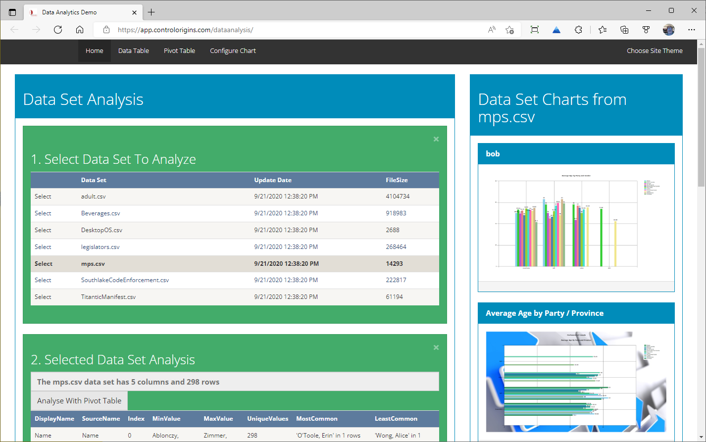
DAWPM transforms CSV data into interactive visualizations, pivot tables, and detailed analytics. Built with ASP.NET WebForms 4.8 (VB.NET), featuring a modern Webpack build system, Bootstrap 5.3, DataTables 2.3, D3.js/C3.js charting, and PivotTable.js with drag-and-drop analysis.
Working through something similar?
If this maps to something you're working on, I'm glad to compare notes. Start with the system and the constraint that matters most.